
Blog 7: Branding
- luhoward
- Jan 19, 2024
- 3 min read
Updated: Apr 18, 2024
Since two of our group members are artists and we only have three guys, we decided to do something that's out of the range of casual music video art design and go for some bothersome disturbing image, such as sticking eyeballs on the lemon tree as lemons, to make surreal images.
This is one of the videos from which I get ideas. Crumb is an American psychedelic rock band.
If you look through some of their music videos, you will get a similar branding style of weird stuff that doesn't even look like things that a carbon-based life can create. ITS SUPER WEIRD.

And these floppy, loopy, jellyish images
Anyway, it's down to Steve Neal's genre theory. Their music is psychedelic rock; therefore, the style of the MV should match up.

This is their cover of the album CRUMB. The style fuses reality and a floppy line with contrasting colors.
The image itself is meaningless, but it's kind of trying to create meaning out of meaningless that they are trying to convey their idea of chaos and turbulence. (Yes, Marshel Mcluhan)
Their recent year albums' art design draws heavily on the dream-core or more surreal design that presents a distorted reality.
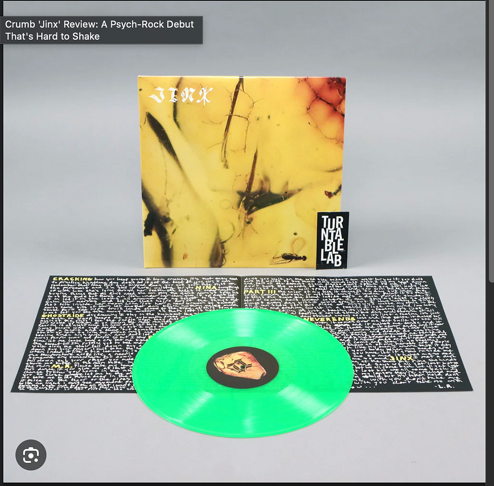
I mean...Is this something like a wasp inside?
This is Jinx by Crum's Digipak, and as always, contrasting color designs and floppy fonts are part of their branding.
"There’s a jazzy modulation/tempo change (“Part III”) or detuned synth buzzing like an angry wasp (“And It Never Ends”) to disorient you."
....Yep, that's a wasp in some sort of glue in the cover.

👈Their Instagram. They seem to like film tapes.
(https://www.instagram.com/some_crumb/ if the page does not work)
Putting Crumb into Jenkins's fandom theory, Crumb emphasizes the strong parallel between their own lives and the events of the series. If you look at their Instagram, you will find mixtures of their group and event photos, allowing the audience to get to know them better by feeling closer to them while still getting advertised for their newest albums.
We are now moving on to us. Our preliminary is based on the song Sound of Silence, where our branding is mostly about dark tones and depression. I am the only one who does not study art in our group, so I'm not weighted on the final digipak art design, and Danny should do much better than I do. But I'm pretty sure we'll get something disturbing, like eyeballs hanging on a tree made by human nerves.
Therefore, it will be an indie-released pak targeting teenagers around 18-30 who are pretty rebellious but have a good musical taste(because it's an old song). It's not going to be suitable for underage kids. It's going to connotate the representation of psychedelic cultures and start from the perspectives of psychopaths. Anyway, it is going to be against the social norms. An excellent advertising platform should be Instagram since many indie bands use Instagram to promote, as audiences expect to see group photos or info about the band's life on Instagram, like what Crumb does. We will have some of the album context photos and some of the band photos, as well as an exact copy of Crumb.
Our name will be "The Supreme Lemon," which is made up of a cultist god figure. This challenges how usually a band is named not in a religious way, which might sound a bit naive but might attract audiences who might find the name weird, hilarious, or interesting.
Being "The Supreme Lemon" does not mean we have a lemon image in our branding, like what the Fool's Garden does. In contrast, the iconic item will be a bloody axe to form a contrast with the lemon that is not often associated with violence.
Our design will be anti-minimalism, which represents the chaotic inner world of Louis, who represents psychopaths that traditional social media does not talk a lot about. This means that our audiences will not be trendy and will depict the fact that our branding has nothing to do with fashion.
*Danny have just bought a bag of condoms for production *
We will be cooperating with implicit homosexual representation in our MV. Therefore, this will target female audiences who are interested in seeing gay fandoms or are actually homosexual. By targeting these audiences, we will be able to encourage them to buy the synergy product that we have - Durex condoms
"A base for consumer activism fans' speak back to the networks and producer"🤣


Comments